

Liquid Lock Screen: KaLock
3D Viet Ha
I tested Liquid Lock Screen: KaLock as a personalization app with a very particular appeal: it can make the lock screen feel more expressive than the standard wallpaper-and-clock setup. Its focus is on themed lock screens, depth-effect wallpapers, and playful widgets, so the experience is less about changing one background and more about giving the first screen you see each day a distinct mood.
That sounds simple, but a lock screen becomes more complicated when a phone is shared around a household. One person may want a calm, readable layout, while another may prefer something colorful and noticeable. I found that this app is most interesting when treated as a visual customization tool rather than a complete household-management solution. It can help each user make a device feel personal, but it does not replace separate accounts, privacy settings, or a clear agreement about who changes what.
The app is free to download, with optional purchases ranging from $0.99 to $29.99 per item. It is developed by 3D Viet Ha, carries an Everyone age rating, and is available for devices running Android 6.0 or later. Its current version is 0.1.11, while its average store rating sits at 3.4 from around 1.6 thousand ratings. Those figures suggest a mixed first impression, so I approached it with the same question I would ask before recommending any customization app: does the visual payoff justify the extra setup and possible compromises?
Making a shared phone feel personal
A realistic household example is a phone that moves between a parent, a partner, and a child during the day. Perhaps one person uses it for navigation, another checks messages, and someone else borrows it for music or a quick game. In that situation, a lock screen can become a small point of friction. A busy design may be fun for one user but make notifications harder to read for another. A dark, minimal wallpaper may suit work hours but feel dull to someone else.
This is where the app’s themes and widgets can be useful. Instead of relying on the same static background, I could think in terms of a visual arrangement: a wallpaper that creates depth, a widget that gives the screen a little character, and a theme that makes the whole result feel intentional. The benefit is not just decoration. A distinctive lock screen can also make it immediately obvious whose preferred setup is currently active on a shared device.
Related News

Why WhatsApp Messenger Still Makes Everyday Communication Feel Easy

Jurassic World: The Game Is the Better Dino Tycoon for Strategic Players

Threads in Real Life: Who Should Join, Lurk, or Leave

How SHEIN Turned Shopping Into an Endless Content Feed

How to Make Fortnite Feel Smarter on Mobile

Should You Switch to Microsoft Outlook on Mobile?
That advantage has a boundary, though. I would not treat a customized lock screen as proof of ownership or as a privacy barrier. If several people use the same phone, the design may help with recognition, but it does not create separate spaces or prevent another person from seeing whatever the operating system already shows. For a household, the app works best as a visual signal, not as an account boundary.
I also think the experience makes more sense on a phone that stays in one person’s hands most of the time. On a personal device, the lock screen is seen repeatedly, so small visual choices have a cumulative effect. On a shared device, constant changes can become confusing. Before installing it, I would decide whether the goal is a stable family setup or a personal look that should remain under one user’s control.
What the first setup really involves
The most important part of using a lock-screen customization app is not choosing the most dramatic design. It is checking whether the result remains practical after the novelty wears off. I recommend starting with a simple theme and a wallpaper whose main subject does not sit directly behind the clock or notification area. A depth effect can look impressive in a preview but become visually crowded once real alerts and icons appear.
Gallery
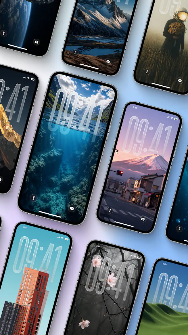
My preferred workflow would be to make one change at a time. First choose the wallpaper, then check the clock and notification readability, and only afterward add a widget. This makes it easier to identify what causes a problem if the final screen feels cluttered. It also avoids the common mistake of judging the design only from a clean preview that contains no real-world information.
On a shared phone, I would take a screenshot of the agreed layout before experimenting further. That is a small but useful household habit: if someone changes the appearance and the result does not work for everyone, returning to the earlier arrangement is easier. The screenshot is not a backup system supplied by the app; it is simply a practical reference for people coordinating around one device.
Another useful distinction is between visual personalization and daily usability. A high-contrast theme may be easier to recognize from across a room, while a detailed image may be more attractive when viewed up close. If the phone is often used in bright kitchens, cars, or hallways, readability matters more than a polished preview. I would test the lock screen in the places where the device is actually used rather than deciding from a single indoor glance.
Keeping setup boundaries clear
Household use raises a question that customization apps rarely solve by themselves: who is allowed to change the lock screen? If everyone edits it whenever they feel like it, the design becomes a rotating argument rather than a useful shared choice. I would establish a simple rule before installing multiple themes: one person handles changes, or the household agrees on a small set of acceptable layouts.
This is particularly important when a child borrows a parent’s phone. The app’s Everyone rating makes it suitable for a broad audience in terms of content classification, but that should not be confused with a promise of family supervision or separate child access. An age rating describes the app’s general content context; it does not decide whether a particular child should be trusted with the device’s settings.
For younger users, I would let them help select colors or a wallpaper while keeping final control of the phone’s broader configuration with the owner. That approach preserves the fun part of personalization without turning a lock-screen change into an accidental change to the device’s wider routine. The app can be part of a shared decision, but it should not be mistaken for a family-control layer.
There is also a practical account-boundary issue. If the phone contains work notifications, banking alerts, private messages, or personal photographs, a decorative lock screen does not separate those areas for different users. I would only recommend shared use when the people involved already have a comfortable arrangement for the device itself. The app adds appearance; it does not create a safer sharing model.
Coordinating themes, widgets, and readability
The widgets are the feature I would approach most carefully. They can make the lock screen feel more useful and playful, but every additional element competes with the information the operating system already places there. My practical rule is to add one widget, live with it for a day, and then decide whether a second element genuinely helps. If the screen needs explanation before someone can read it, the design has gone too far.
Depth-effect wallpapers deserve a similar test. Their appeal comes from giving the image a layered appearance, but the effect is strongest when the subject and the clock have enough visual separation. A portrait, object, or bold shape can work well when it frames the information instead of covering it. If the wallpaper has too much detail near the center, the depth treatment may be technically attractive but functionally distracting.
For a household, I would coordinate around roles rather than personal taste alone. A parent who checks the time frequently may want a clean clock area. A teenager may care more about a vivid image. Someone with weaker eyesight may need a simpler background and clearer contrast. The best shared compromise is not necessarily the most exciting theme; it is the one that keeps the phone legible for the person who relies on it most.
One non-obvious trade-off is that a visually distinctive lock screen can improve recognition but reduce discretion. If the design makes the device easy to identify, it may also make it obvious which person’s phone is lying on a table. That is harmless in many homes, but not ideal for anyone who prefers a low-profile appearance. I would choose a recognizable theme for convenience and a restrained one for privacy-conscious environments.
I would also avoid changing the design immediately before someone needs the phone for an important task. A shared device should have a predictable fallback. If the family is leaving for an appointment, driving, or dealing with an urgent message, visual experimentation can wait. The lock screen is a small part of the phone, but it is also the first interaction point, so unnecessary surprises are more irritating than they seem.
Age, trust, and everyday ownership
The app’s Everyone rating makes it easy to consider for mixed-age households, but the more meaningful question is how much control each person should have. A child can reasonably participate in choosing an animal, color scheme, or playful widget without being given unrestricted control over a device used for adult communication. That distinction helped me see the app as a conversation starter rather than a supervision tool.
In practice, I would create a shared selection process. Each person could suggest a visual direction, then the device owner could check whether the lock screen remains readable and appropriate for notifications. This avoids framing customization as a reward or punishment. It becomes a small household decision with clear responsibility, which is more sustainable than allowing whoever picks up the phone first to redesign it.
Trust matters because the lock screen is visible even when the phone is not unlocked. A child may enjoy a large, colorful design, while an adult may not want private notifications surrounded by distracting graphics. I would check the final result with real notifications present and decide whether the information remains easy to scan. If the device displays sensitive previews, a simpler design is usually the wiser choice.
The app is less suitable for someone who expects a full family profile system. If your main need is to keep work, school, and personal activity completely separate, a personalization app cannot solve that problem. A phone with proper user separation, a guest mode, or stronger operating-system controls would be a better starting point. KaLock can decorate an existing arrangement, but it should not be used to compensate for missing boundaries.
It is also worth considering who will maintain the setup. If one person enjoys adjusting wallpapers and widgets, the app may become a pleasant hobby. If nobody wants to revisit the layout after installation, a simpler static wallpaper may be more practical. Customization has a maintenance cost, even when that cost is only occasional rechecking after notifications, system changes, or a different person begins using the device.
How it compares with ordinary alternatives
The usual alternative is the phone’s built-in wallpaper and lock-screen editor. That option is normally better when speed, stability, and minimal configuration matter most. It is the choice I would make for an older relative, a work phone, or a shared device where everyone needs the same predictable screen. The built-in tools may feel less expressive, but they usually keep the number of decisions under control.
KaLock is more appealing when the standard editor feels too plain. Its combination of themes, depth-style backgrounds, and widgets gives the lock screen a stronger visual identity than a single wallpaper can provide. I would recommend it to someone who enjoys tuning the appearance of a phone and is willing to judge the result by everyday readability rather than by the preview alone.
The trade-off is that more visual control can mean more opportunities for clutter or inconsistency. A built-in setup is easier to explain to another household member because there are fewer moving parts. This app is better for deliberate personalization, not for people who want to make one change and never think about the lock screen again.
There is also a cost consideration. The app itself is free, which makes trying it relatively easy, but optional purchases can reach $29.99 for an individual item. I would explore the free experience first and avoid paying simply because a preview looks more elaborate. A purchase makes sense only if the particular visual style solves a real preference and remains useful after several days of ordinary phone use.
Where the current experience may frustrate you
The mixed average rating is a useful warning to keep expectations realistic. I enjoyed the idea of a more expressive lock screen, but customization quality is highly personal. A design that looks polished to one user may feel too busy to another, especially when the phone receives many notifications. The app’s value depends on whether its visual language matches your taste and your device habits.
I would also be cautious about using it on a phone that must remain extremely predictable. Shared household devices often benefit from a stable appearance because people need to recognize information quickly. If a new theme makes the clock harder to read or causes someone to miss a notification, the visual improvement is not worth it. In that situation, the standard lock screen is the better tool.
Another limitation is conceptual rather than visual: the app does not solve disagreements about ownership. A family may still need to decide whose preferences take priority, whether children can make changes, and whether the phone should show notification previews. No theme or widget can answer those questions. The app works smoothly only after those boundaries are already clear.
Because the current version is still 0.1.11, I would treat it as an experience worth testing rather than a reason to rebuild the way a household manages devices. That does not make it unusable; it simply means I would keep the setup reversible and avoid relying on it for anything beyond appearance. A low-risk trial is sensible, especially because the download is free.
My household verdict
I would recommend Liquid Lock Screen: KaLock to a person who wants a more distinctive lock screen and enjoys making careful visual choices. The depth-effect wallpapers can give a familiar phone a fresh look, while the themes and widgets offer more personality than the usual single-background setup. For a personal device, that is a convincing reason to try it.
For a shared household phone, my recommendation is more conditional. Use it to coordinate a recognizable, readable design, not to create privacy, profiles, or parental boundaries. Agree on who manages changes, test the layout with actual notifications, and keep a simple fallback in mind. Those steps matter more than choosing the most dramatic theme.
I would skip it if your priority is absolute simplicity, strict separation between users, or a lock screen that nobody needs to maintain. I would also avoid paying for an elaborate item until the free setup has proved comfortable in daily use. The best result is not the screen with the most effects; it is the one that still feels clear when someone is rushing, sharing the phone, or checking it in poor lighting.
Overall, I see this as a focused personalization app with genuine visual appeal and a few important limits. It is free to start, suitable for an Everyone-rated audience, and backed by 3D Viet Ha, but its usefulness depends on thoughtful setup. For me, the winning approach is restrained customization: one strong wallpaper, a readable arrangement, and household rules that exist outside the app. Used that way, it can make the lock screen feel personal without pretending to be something it is not.
FAQs for Liquid Lock Screen: KaLock
What is Liquid Lock Screen: KaLock, and how does it work?
Liquid Lock Screen: KaLock is a personalization app that gives your device a fluid, animated lock-screen effect inspired by moving liquid. After installation, you typically enable the required lock-screen or display permissions, choose an animation style, and customize visual settings such as colors, motion, and effects. The exact experience may vary depending on your Android version, manufacturer interface, and available system permissions.
Is Liquid Lock Screen: KaLock compatible with every Android phone?
The app is designed primarily for Android devices, but compatibility can differ between phones and operating-system versions. Some manufacturers restrict third-party lock-screen replacements, live wallpapers, overlay effects, or background activity, which may prevent certain features from working correctly. Before downloading, check the Google Play listing for supported Android versions and test whether your device allows the permissions needed by the app.
Does Liquid Lock Screen: KaLock replace my normal lock-screen security?
A visual lock-screen application should not be treated as a replacement for Android security features such as a PIN, password, pattern, fingerprint, or face unlock. Depending on how KaLock is configured, it may provide an animated appearance while your phone’s built-in security remains responsible for protecting access. Review its settings carefully and keep a secure system lock enabled, especially if the app requests accessibility, overlay, or device-administration permissions.
Does Liquid Lock Screen: KaLock use a lot of battery or affect phone performance?
Animated lock-screen effects can consume more battery and system resources than a static wallpaper, particularly on older phones or devices with high-refresh-rate displays. In testing, the impact generally depends on animation complexity, brightness, how often the screen is activated, and whether the app continues running in the background. If battery drain or lag appears, reduce the effect intensity, disable unnecessary animations, or remove battery-optimization exceptions.
Is Liquid Lock Screen: KaLock free, and does it contain advertisements or in-app purchases?
Availability, advertising, and premium features can change between app versions, regions, and distribution platforms. The free version may include advertisements or limit certain visual effects, customization tools, or themes, while optional purchases may unlock additional features. Check the current store page before installing and review the permissions, privacy information, subscription terms, and cancellation conditions if the app offers recurring payments.
Pros
- Creates a fun water-ripple effect when unlocking
- Offers a distinctive alternative to standard lock screens
- Lightweight design with simple
- easy-to-use controls
- Can add personality to an otherwise plain device interface
- Visual effects are generally quick and responsive
Cons
- May require extra permissions to function as a lock screen
- Compatibility can vary across Android versions and devices
- Animations may consume additional battery over time
- Could conflict with built-in security or biometric unlocking
- Some users may find the effect distracting during frequent unlocking


